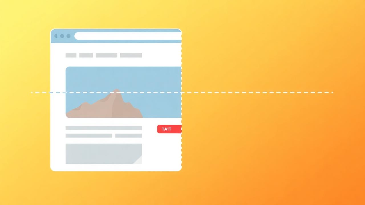

Visitors decide whether to stay or leave in 2.6 seconds. The content they see above the fold — before scrolling — determines that decision. Getting this first impression right is the single highest-leverage optimization you can make. This guide covers exactly what to show above the fold, how to structure it, and how to adapt for different devices and page types.
What Is Above the Fold and Why Does It Matter?
"Above the fold" is the content visible without scrolling — typically the top 600-800px on desktop and 500-700px on mobile. It matters because 57% of user attention goes to above-fold content, and bounce rates increase 100% when above-fold content fails to communicate value.
The term comes from newspapers, where the most important stories were placed above the physical fold of the paper. On the web, it's even more critical because visitors can leave instantly. Key statistics:
- 57% of attention: Nielsen Norman Group research shows that 57% of viewing time is spent above the fold, with 74% spent in the first two screenfuls.
- 2.6-second decision: Visitors form their first impression in 2.6 seconds. If they don't immediately understand what you offer and why they must care, they leave.
- 80% never scroll: On poorly designed pages, up to 80% of visitors never scroll past the first screenful. Your above-fold content must work as a standalone conversion argument.
How Do You Structure the Hero Section?
The optimal hero section has five elements in this priority order: a clear value proposition headline, a supporting subheadline that expands on the benefit, a primary CTA button, a trust signal (social proof or logos), and a visual that demonstrates the product or outcome.
Hero section framework:
- Headline (40% of above-fold impact): One sentence that answers two questions: What is this, and why does it matter to me? Focus on the outcome, not the product.
- Subheadline: Expand the headline with specifics: who it's for, what it does, and one key differentiator.
- CTA button: High-contrast, action-oriented, above the fold. "Start Free Trial" outperforms "Learn More" by 30-50% on product pages.
- Trust signal: Logo strip ("Trusted by teams at..."), star rating ("4.8★ from 500+ reviews"), or a micro-testimonial.
- Visual: Product screenshot, demo animation, or outcome-focused image. Should support the headline, not compete with it for attention.
What Makes an Effective Above-the-Fold Headline?
The best headlines follow the formula: [Desired outcome] + [Without the pain point] — "Increase conversions 30% without changing your website" outperforms feature-focused headlines like "Real-time social proof notification platform" by 3-5x in conversion.
Headline formulas that convert:
- Outcome + pain removal: "Get more customers without spending more on ads" — addresses what they want and what they want to avoid.
- Specific metric: "Increase conversions 30% in 30 days" — concrete numbers are 2x more believable than vague promises.
- Social proof headline: "Join 2,000+ businesses that trust NotiProof for social proof" — leverages crowd wisdom in the headline itself.
- Question format: "What if your website could convert 30% more visitors?" — engages curiosity and self-identification.
How Do You Create Effective Visual Hierarchy?
Guide the eye in a Z-pattern (left headline → right visual → left supporting text → right CTA) or F-pattern (headline → subheadline → CTA stacked left-aligned), using size, contrast, and whitespace to direct attention in the correct sequence.
Visual hierarchy principles:
- Size = importance: The headline must be the largest text element. The CTA button must be the most visually prominent interactive element.
- Contrast: The CTA button must have the highest contrast on the page. If your background is light, use a saturated primary color button. If dark, use a bright accent.
- Whitespace: Don't fill every pixel. Generous whitespace around key elements (headline, CTA) increases readability and draws attention through isolation.
- Directional cues: Human faces looking toward the CTA, arrows, or converging lines guide eye movement toward the conversion action.
Does Social Proof Belong Above the Fold?
Yes — but keep it compact. A logo strip, star rating, or customer count belongs above the fold. Full testimonials and review sections belong below the fold. The above-fold social proof signal must be one line that establishes credibility without competing with the headline and CTA.
Above-fold social proof options (choose one):
- Logo strip: 4-6 recognizable customer logos. "Trusted by teams at Shopify, HubSpot, and 2,000+ more"
- Aggregate rating: "★★★★★ 4.8 average from 500+ reviews"
- Customer count: "Join 10,000+ marketers using NotiProof"
- Micro-testimonial: One powerful sentence: "'Increased our trial signups 35% in 2 weeks' — VP Marketing, Acme Corp"
Pair above-fold static social proof with dynamic social proof notifications that appear as visitors browse, reinforcing trust throughout the page visit.
Where Does the Primary CTA Go?
The primary CTA must be visible above the fold, placed after the headline and subheadline so visitors understand the value before being asked to act. On mobile, use a sticky CTA bar that remains accessible as users scroll.
CTA placement rules:
- After value, before details: The CTA must come after the headline (what you get) and before the feature details (how it works). Visitors who are convinced by the headline can act immediately; others scroll for more info.
- Repeated at scroll milestones: Repeat the CTA at the bottom of each major section as users scroll. Don't make them scroll back up to convert.
- Two CTAs above fold: Consider a primary ("Start Free Trial") and secondary ("Watch Demo") CTA to capture visitors at different readiness levels.
How Does Above the Fold Differ on Mobile?
On mobile, above the fold is only 500-700px tall — prioritize headline and CTA above fold, move the visual below fold, and use a sticky CTA bar. Mobile above-fold must be even more ruthlessly prioritized than desktop.
Mobile above-fold priorities:
- Headline (must be above fold)
- Subheadline (must be above fold)
- CTA button (must be above fold)
- Trust signal (kept above the fold and limited to one line)
- Visual (can go below fold on mobile)
The product screenshot or hero image that's essential on desktop can be moved below the fold on mobile without impacting conversion — text + CTA are more important on small screens.
Key Takeaways
- 57% of user attention goes to above-fold content — optimize this first for maximum impact
- Five elements in priority order: headline, subheadline, CTA, trust signal, visual
- Headlines must follow "desired outcome + without pain point" formula
- Keep social proof above the fold but compact — one line, not full testimonial blocks
- CTA must be above fold on all devices, with a sticky bar on mobile
- On mobile, text + CTA take priority over visuals in the limited above-fold space