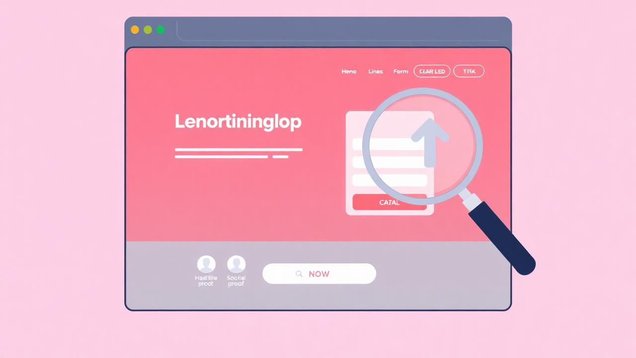

Your landing page is where conversions happen — or don't. Research shows that companies with 30+ landing pages generate 7× more leads than those with fewer than 10, and optimized landing pages convert at 2–5× the rate of unoptimized ones. This guide covers every element that matters.
What Makes a High-Converting Landing Page?
High-converting landing pages share five elements: a clear headline matching visitor intent, a specific value proposition, strategically placed social proof, a prominent CTA, and minimal distractions.
The best landing pages follow a psychological sequence: attention → interest → trust → action. The headline grabs attention, the value proposition creates interest, social proof builds trust, and the CTA drives action. Every element on the page serves one of these four purposes — anything else is a distraction.
Research from Unbounce analyzing 64,000 landing pages found that the average conversion rate is 4.02%, but the top 25% convert at 5.31% or higher. The difference isn't design trends — it's strategic optimization of these five core elements.
How Do You Write Headlines That Convert?
The best headlines combine a specific benefit with a trust signal — "Join 10,000+ businesses that increased conversions by 25%" outperforms generic headlines by 30–50% in A/B tests.
Your headline has approximately 3 seconds to convince a visitor to stay. It must answer three questions instantly: What is this? What's in it for me? Why trust it?
Benefit-driven headlines outperform feature-driven ones consistently. "Increase your conversion rate by 25%" beats "AI-powered notification platform" because it speaks to the outcome visitors want, not the technology you built.
Social proof in headlines adds instant credibility. "Trusted by 2,000+ conversion-focused teams" or "The #1 rated social proof platform on G2" gives visitors a reason to believe your claim. NotiProof's visitor counter can dynamically display real metrics that reinforce this trust.
How Do You Craft a Compelling Value Proposition?
A strong value proposition answers "Why you over the alternative?" — test the format: [Outcome] + [Timeframe] + [Without the usual pain], such as "Boost conversions in 5 minutes without writing code."
Your value proposition must be the subheading or first body paragraph. It needs to differentiate you from competitors and clearly state the transformation you deliver. The formula that consistently tests best:
[Desired outcome] + [Specific timeframe] + [Without the usual pain point]
Example: "Increase website conversions by 10–35% in under 5 minutes, without developers or complex setup." This communicates the benefit (more conversions), sets expectations (fast implementation), and removes objections (no dev resources needed).
Where Do You Place Social Proof on Landing Pages?
Place social proof in three critical zones: above the fold (logo bar or stat), next to the CTA (testimonial or review), and at the pricing section (case study or ROI metric) — each placement addresses different objections.
Social proof placement is as important as the proof itself. The three highest-impact positions:
- Above the fold — trust bar: A strip of client logos, "Trusted by X,000 companies," or aggregate review scores. This establishes credibility before visitors invest cognitive effort in reading your content.
- Next to CTAs — validation: A short customer testimonial or star rating next to your primary CTA reduces anxiety at the decision point. "This tool paid for itself in the first week" next to a "Start Free Trial" button removes the risk perception.
- At pricing — justification: Case study excerpts, ROI calculations, or real-time signup notifications near pricing tables validate the investment. "Sarah from Austin just signed up" creates both urgency and validation.
How Do You Design CTAs That Get Clicks?
CTAs must use action-oriented, benefit-focused copy ("Start Converting More" vs. "Submit"), contrasting colors, generous whitespace, and be visible without scrolling — test button copy before design.
CTA optimization is often the fastest path to a measurable conversion lift. Key principles from thousands of A/B tests:
- Copy: Use first-person, benefit-driven language. "Start My Free Trial" outperforms "Sign Up" by 25–90% in most tests. For the full playbook: CTA Optimization Guide →
- Color: The CTA must be the most visually prominent element. High contrast with the surrounding design is more important than specific color. Green doesn't always win — contrast does.
- Size and spacing: Generously sized buttons with ample whitespace. On mobile, CTAs must be at least 48px tall for comfortable tapping.
How Do You Reduce Landing Page Friction?
Reduce friction by removing navigation links, minimizing form fields, adding progress indicators, displaying security badges, and ensuring page load time is under 3 seconds.
Friction is anything that creates hesitation, confusion, or effort. Common friction sources on landing pages:
- Too many form fields: Each additional field reduces conversions by 5–10%. Only ask for what you absolutely need at this stage.
- Slow page load: A 1-second delay reduces conversions by 7%. Optimize images, minify scripts, and use a CDN.
- Navigation distractions: Remove or minimize navigation on dedicated landing pages. Every link is a potential exit.
- Missing trust signals: No trust badges, no reviews, no recognizable logos = high perceived risk. Add security seals, privacy assurances, and social proof.
How Do You Optimize for Mobile Conversions?
Mobile optimization requires thumb-friendly CTAs, single-column layouts, compressed media, tap-to-call buttons, and mobile-specific social proof placement — mobile visitors convert 50% less than desktop on average.
Mobile traffic now accounts for 60%+ of web visits but converts at roughly half the rate of desktop. The gap represents a massive CRO opportunity. Key mobile-specific optimizations:
- Single-column layout with generous vertical spacing
- CTAs within thumb reach (bottom of viewport)
- Collapsible sections for long content
- Simplified forms with autofill support
- Social proof that doesn't push CTAs below the fold
What Do You A/B Test First?
Test in this order for maximum impact: 1) Headline, 2) CTA copy, 3) Social proof type/placement, 4) Form length, 5) Page layout — each of these independently drives 10–30% conversion differences.
Not all tests are equal. Prioritize by potential impact. The typical priority order based on thousands of tests across industries:
- Headline: The single biggest conversion lever. Test benefit vs. feature framing, specificity levels, and social proof integration.
- CTA: Test copy, color, size, and position. Easy to implement, fast results.
- Social proof: Test different types (testimonials vs. notifications vs. counters), placements, and messaging. Use NotiProof's campaign builder for rapid iteration.
- Form design: Test field count, layout, and progressive disclosure.
- Page layout: Test long-form vs. short-form, video vs. text, and section ordering.
Key Takeaways
- Landing pages follow a psychological sequence: attention → interest → trust → action
- Benefit-driven headlines outperform feature-driven ones by 30–50%
- Social proof must appear in three zones: above fold, next to CTAs, and at pricing
- Reducing form fields by even one can improve conversions by 5–10%
- Mobile optimization is the biggest untapped CRO opportunity for most businesses
- Test headlines first — they have the highest impact potential of any single element