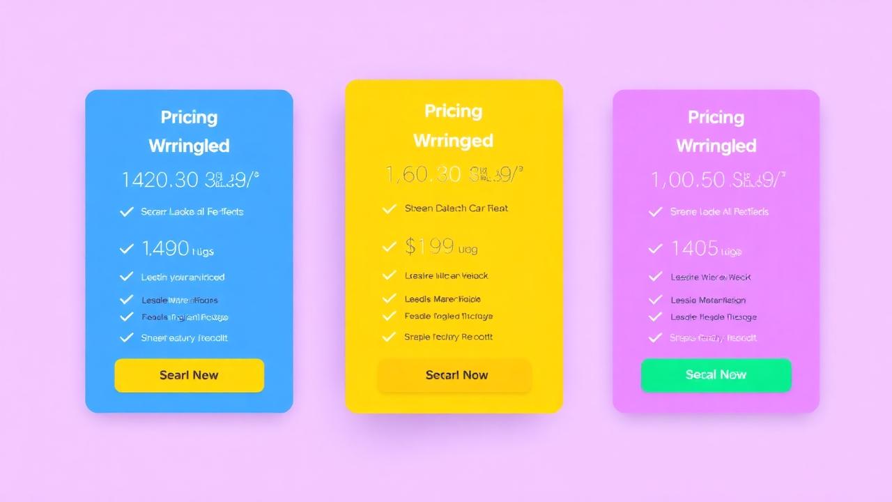

Your pricing page is the highest-intent page on your website — visitors who reach it are actively evaluating whether to buy. Yet most pricing pages are designed as information tables rather than conversion-optimized experiences. The difference between a mediocre and excellent pricing page can mean a 20-40% swing in conversion rate. This guide covers the psychology, structure, and social proof tactics that convert pricing page visitors into customers.
How Does Psychology Affect Pricing Page Conversions?
Three psychological principles dominate pricing page behavior: anchoring (the first price seen sets expectations), the decoy effect (a strategically inferior option makes the target tier look better), and loss aversion (framing upgrades as avoiding missed benefits).
Key psychological levers:
- Anchoring: Show the most expensive plan first (right to left) so the mid-tier feels like a bargain. Or show the enterprise tier prominently to anchor high, making the business tier feel affordable.
- Decoy effect: If you want to sell the $49/mo plan, create a $39/mo plan with significantly fewer features. The $10 difference for substantially more value makes $49 feel like the obvious choice.
- Loss aversion: Frame tier comparisons as "what you miss" not just "what you get." "Basic plan doesn't include: A/B testing, priority support, custom branding" triggers loss aversion more powerfully than listing what's included.
- Center-stage effect: The middle option in a 3-tier layout gets selected 60% of the time. Make your target plan the center option.
How Do You Structure Pricing Tiers?
Three tiers is optimal for most businesses — a basic plan (entry point), a recommended plan (best value, visually highlighted), and a premium plan (for power users/enterprises). Highlight the recommended plan with visual emphasis and a "Most Popular" badge.
Tier structure best practices:
- Three tiers: Two creates a 50/50 split with no guidance. Four creates decision paralysis. Three provides a clear recommendation with a natural "Goldilocks" middle option.
- Visual hierarchy: The recommended plan must be visually larger, bordered, or elevated. Use a "Most Popular" or "Best Value" badge. Color it differently from the other two.
- Naming: Use aspirational names (Starter → Growth → Scale) rather than generic ones (Basic → Standard → Premium). Names reflect what the customer becomes, not what they pay for.
- Feature comparison: Show a simplified feature list on the pricing cards, with a "Compare all features" link to a detailed comparison table below.
Where Does Social Proof Go on Pricing Pages?
Place ROI-focused testimonials between the pricing table and the FAQ section, add customer logos above the tiers ("Trusted by 2,000+ businesses"), and include plan-specific testimonials that address the value of each tier level.
Social proof placement on pricing pages:
- Above tiers: Logo strip of recognizable customers + "Trusted by 2,000+ businesses" or "4.8★ average from 500+ reviews." Establishes credibility before price comparison begins.
- Per-tier testimonials: A small quote under each plan from a customer on that specific plan. "Growth plan user: 'Paid for itself in the first week'" validates the investment at the plan level.
- Below tiers: 2-3 ROI-focused testimonials with specific metrics: "Increased conversions 35% — the $49/mo pays for itself 10x over." These address the #1 pricing page objection: "Is it worth it?"
- Social proof notifications: Real-time notifications showing recent signups ("Emma just started a Growth trial") create urgency on the pricing page.
How Do You Address Objections on Pricing Pages?
Add an FAQ section below the pricing table that directly answers the top 5-7 objections: "Can I cancel anytime?", "Is there a free trial?", "What happens if I exceed my plan limits?", "Do you offer refunds?", and "Can I switch plans later?"
Essential pricing page FAQs:
- "Can I cancel anytime?" — "Yes, cancel with one click. No contracts, no cancellation fees."
- "Is there a free trial?" — "Yes, 14-day free trial on all plans. No credit card required to start."
- "What if I need more than the plan includes?" — "You'll get a notification before reaching limits. Upgrade or downgrade anytime."
- "Do you offer refunds?" — "30-day money-back guarantee on all plans. No questions asked."
- "Do you offer discounts for annual plans?" — "Yes, save 20% with annual billing."
How Do You Encourage Annual Plan Selection?
Default the pricing toggle to annual billing, show the monthly price crossed out with annual savings ("Save $120/year"), and display the annual price as a monthly equivalent ("$39/mo billed annually") — annual-first display increases annual plan adoption by 30-40%.
Annual plan optimization tactics:
- Default to annual: Pre-select the annual toggle. Visitors see the lower annual price first, anchoring their expectations. Monthly feels expensive in comparison.
- Show savings: "Save 20%" badge on the annual toggle. Or show "$39/mo" for annual vs. "$49/mo" for monthly with the difference highlighted.
- Monthly equivalent: Always show annual prices as monthly equivalents: "$39/mo (billed annually at $468)" is more digestible than "$468/year."
- Annual-only features: Some companies offer small perks for annual subscribers: priority support, extra users, or bonus features. This adds value beyond just the price discount.
Is a Free Tier Worth It a Free Tier?
A free tier works for product-led growth models where the product sells itself through usage, but it can cannibalize paid plans if the free tier is too generous — limit free to core functionality with clear upgrade triggers tied to growth metrics.
Free tier considerations:
- When free works: Products with strong network effects (collaboration tools), products where usage naturally exceeds free limits (storage, notifications), and markets where competitors offer free tiers.
- When free hurts: High-touch products where free users consume support resources, markets where "free" signals low quality, and when the free tier is generous enough to satisfy most users' needs.
- Free trial alternative: A 14-day free trial of the full product often converts better than a permanent free tier because it creates urgency and demonstrates full value.
Key Takeaways
- Use anchoring, decoy effect, and center-stage psychology to guide tier selection
- Three tiers with a visually highlighted "recommended" option is optimal for most businesses
- Place ROI testimonials between pricing tiers and FAQ; add customer logos above
- Address the top 5-7 objections in an FAQ section directly below the pricing table
- Default to annual billing display to increase annual plan adoption by 30-40%
- Free tiers work for product-led growth; free trials work better for most SaaS products