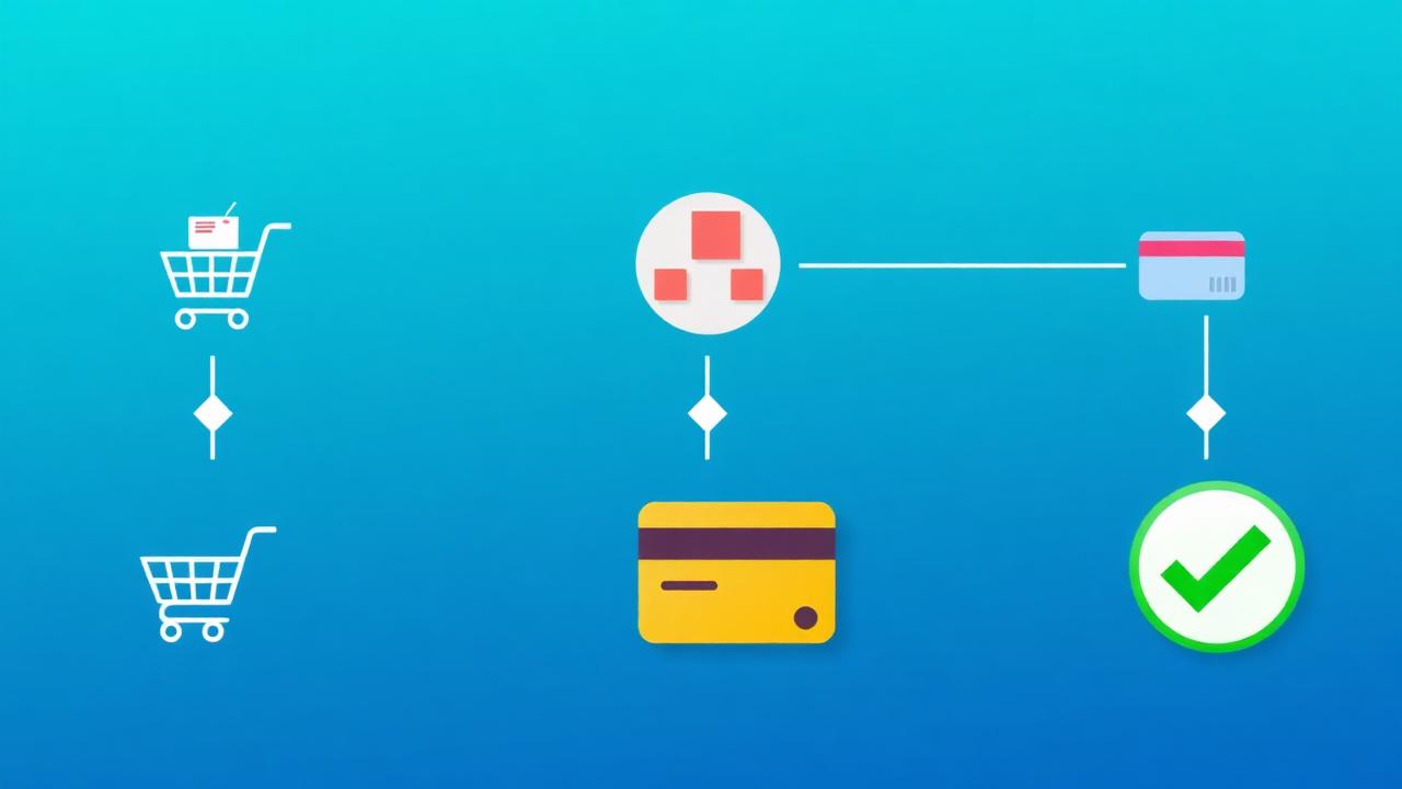

The checkout page is where revenue is won or lost. With average cart abandonment at 70%, even small checkout optimizations produce significant revenue impact. A 1% improvement in checkout completion rate for a store processing $1M annually adds $10,000 in recovered revenue. This guide covers every optimization opportunity from form fields to post-purchase experience.
What Causes Checkout Friction?
The top five friction points are too many form fields (35% of abandonment), forced account creation (24%), lack of trust signals (17%), limited payment options (9%), and confusing navigation that makes it hard to complete the purchase.
Baymard Institute — an independent web UX research organization — identifies these primary checkout friction sources in their large-scale usability studies:
- Form overload: The average checkout has 14.88 form fields. The optimal number is 6-8. Every additional field reduces completion by 2-3%.
- Forced account creation: 24% of shoppers abandon specifically because they were forced to create an account. Always offer guest checkout.
- Trust anxiety: At the moment of entering payment information, trust concerns peak. Missing trust badges or unfamiliar payment processors trigger abandonment.
- Surprise costs: Shipping fees, taxes, and service charges revealed at checkout cause 48% of all abandonment. Show total cost as early as possible.
- Navigation confusion: Can the user easily go back to edit cart items? Is the progress clear? Poor checkout navigation causes 10-15% of abandonment.
How Do You Optimize Checkout Forms?
Reduce fields to 6-8 essentials, use smart defaults (auto-detect country, auto-fill city from ZIP), show inline validation, use a single-column layout, and group related fields visually — optimized forms improve completion rates by 20-30%.
Form optimization tactics:
- Essential fields only: Email, name, address, city, ZIP, country, payment. Remove: phone (make optional), company name (remove unless B2B), address line 2 (make optional).
- Smart auto-fill: Auto-detect country from IP, auto-fill city and state from ZIP code, support browser autofill with correct input types and autocomplete attributes.
- Inline validation: Show green checkmarks as fields are completed correctly. Show errors inline next to the field, not at the top of the form.
- Single column: Two-column form layouts cause 45% more errors than single-column layouts. Keep everything in one column.
- Floating labels: Use floating labels that move above the field on focus, saving vertical space while maintaining clear labeling.
Which Payment Options Increase Conversions?
Offering Apple Pay, Google Pay, and PayPal alongside credit cards increases checkout completion by 12-18% — express payment options that skip form-filling are especially impactful on mobile, where typing is the primary friction source.
Payment option strategy:
- Express payments first: Show Apple Pay, Google Pay, and PayPal above the credit card form. These options skip most of the checkout friction entirely.
- Buy Now Pay Later (BNPL): Klarna, Afterpay, and Affirm increase average order value by 20-30% and reduce checkout abandonment for higher-priced items.
- Local payment methods: iDEAL (Netherlands), Bancontact (Belgium), PIX (Brazil). If you sell internationally, local payment methods can increase regional conversion by 30-50%.
- Saved payment info: For returning customers, pre-fill saved payment methods with 1-click reorder capability. Amazon's 1-Click ordering is the gold standard.
How Do You Build Trust at the Payment Step?
Place security badges (SSL, PCI compliance) immediately near the payment form, show a money-back guarantee below the submit button, and add a compact testimonial addressing payment security concerns — these trust signals reduce payment-page abandonment by 15-25%.
Trust signal placement at checkout:
- SSL/security badge: Next to the credit card number field. "Your payment information is encrypted with 256-bit SSL" with a lock icon.
- Money-back guarantee: Below the "Place Order" button: "30-Day Money-Back Guarantee — No questions asked." This is the last thing they see before committing.
- Payment processor logos: Visa, Mastercard, Amex logos reassure customers their card will be accepted and the transaction is legitimate.
- Micro-testimonial: A single compact review: "★★★★★ Fast shipping, exactly as described — would buy again" provides social validation at the critical moment.
- Contact information: Visible phone number or live chat option. Knowing they can reach a human reduces perceived risk.
Why Is Guest Checkout Critical?
Guest checkout is non-negotiable — 24% of shoppers abandon when forced to create an account. Offer account creation after purchase completion as an optional step, capturing the email during checkout for order updates.
The account creation dilemma:
- Guest first: Default to guest checkout. You already capture their email for order confirmation, which gives you marketing contact capability.
- Post-purchase account offer: On the confirmation page: "Create an account to track your order and get 10% off your next purchase." This converts 20-30% of guest buyers without adding checkout friction.
- Social login: If you do offer account creation, provide Google/Apple login. "Sign in with Google" takes 2 seconds vs. 30+ seconds for manual registration.
How Do You Design the Order Summary?
Keep the order summary visible throughout checkout with product thumbnails, itemized costs (subtotal, shipping, tax, discount), and a clear total — sticky sidebar on desktop, expandable accordion on mobile.
Order summary best practices:
- Product thumbnails: Show small product images so customers can visually confirm their cart. This reduces "wrong item" returns.
- Cost breakdown: Show subtotal, shipping, tax, and discounts as separate line items. No surprise charges.
- Editable quantities: Let customers adjust quantities or remove items without leaving checkout.
- Coupon field: Include but don't make prominent. A prominent empty coupon field causes 27% of shoppers to leave checkout to search for a code.
What Happens After Checkout Matters Too
The confirmation page is prime real estate for account creation (20-30% conversion), referral programs (5-10% share rate), and testimonial collection — post-purchase optimization extends the value of every completed checkout.
Post-checkout optimization:
- Confirmation page: Clear order confirmation, estimated delivery, account creation offer, and social sharing buttons.
- Confirmation email: Send immediately with order details, tracking link, and support contact. This reduces "where's my order?" support tickets.
- Post-purchase email sequence: Delivery notification → Review request (7 days after delivery) → Cross-sell recommendation (14 days). Use optimized email templates.
Key Takeaways
- Reduce form fields from 15 to 6-8 for a 20-30% improvement in checkout completion
- Express payment options (Apple Pay, Google Pay) increase mobile completion by 12-18%
- Place trust badges next to the payment form, guarantee below the submit button
- Guest checkout is non-negotiable — offer account creation post-purchase instead
- Keep order summary visible throughout with product thumbnails and itemized costs
- Use the confirmation page for account creation, referrals, and testimonial requests